GattyBite: the work between a design reference and a usable site
How we built GattyBite with Astra and skills, then fixed mobile layouts, transitions, and extra pages.
The first version of GattyBite looked convincing on a wide screen. Then we changed a two-line description to three lines, and the section jumped. That small failure captures much of this build: getting the reference onto a page was only the start.
GattyBite is our food-brand showcase for prospective clients. We built meal browsing, plan selection, a sample cart, and supporting pages. It is a studio concept, with sample prices and stories. It does not accept orders or payments.
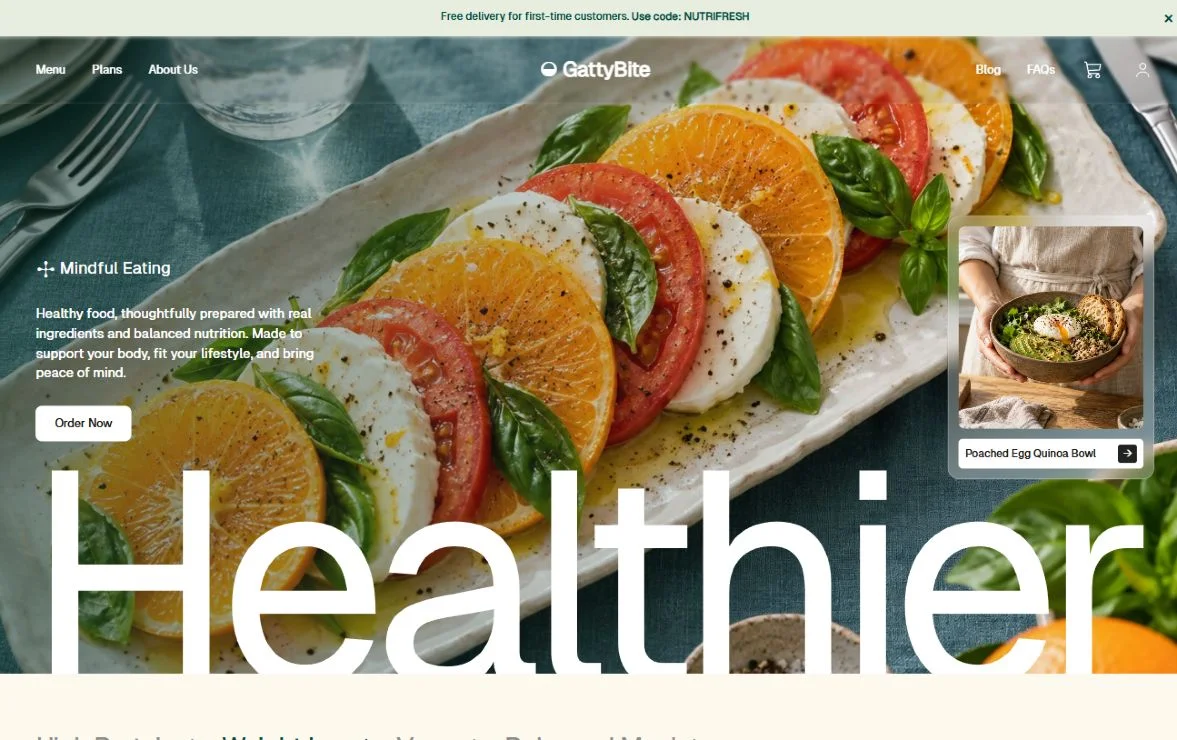
The visual starting point belongs to Plainthing Studio
We started from Homepage Concept for NutriBite, a Healthy Food E-commerce Brand on Dribbble. Permadi Satria Dewanto posted it for Plainthing Studio, and the description credits designer Rima. The oversized type, food photography, and quiet cream-and-green palette gave us a clear direction.
We recreated and extended that direction as GattyBite. This was not a client commission or a collaboration with the original designers. The reference showed a desktop homepage. We still had to decide what happened on phones, after a click, and beyond the homepage.
Mobile needed decisions, not just smaller type
The first mobile category controls became rounded chips. They worked, but lost the reference's text-led character. We changed them to a horizontally scrolling row of names with superscript counts. The selected category stays visible, and each control keeps a useful touch area.
Product names exposed another problem. A longer name pushed its price below the prices beside it. We gave the cards a shared layout so their images, titles, and actions line up. The navigation became a mobile menu, and the cart became a bottom sheet.
Readability also needed adjustment. White hero text crossed bright food photography. A green overlay helped, but the first treatment was too strong. We reduced it on desktop and kept more contrast on mobile. The navigation is almost clear at the top, then gains a stronger frosted background after scrolling.
Meal cards: keep the comparison points in place
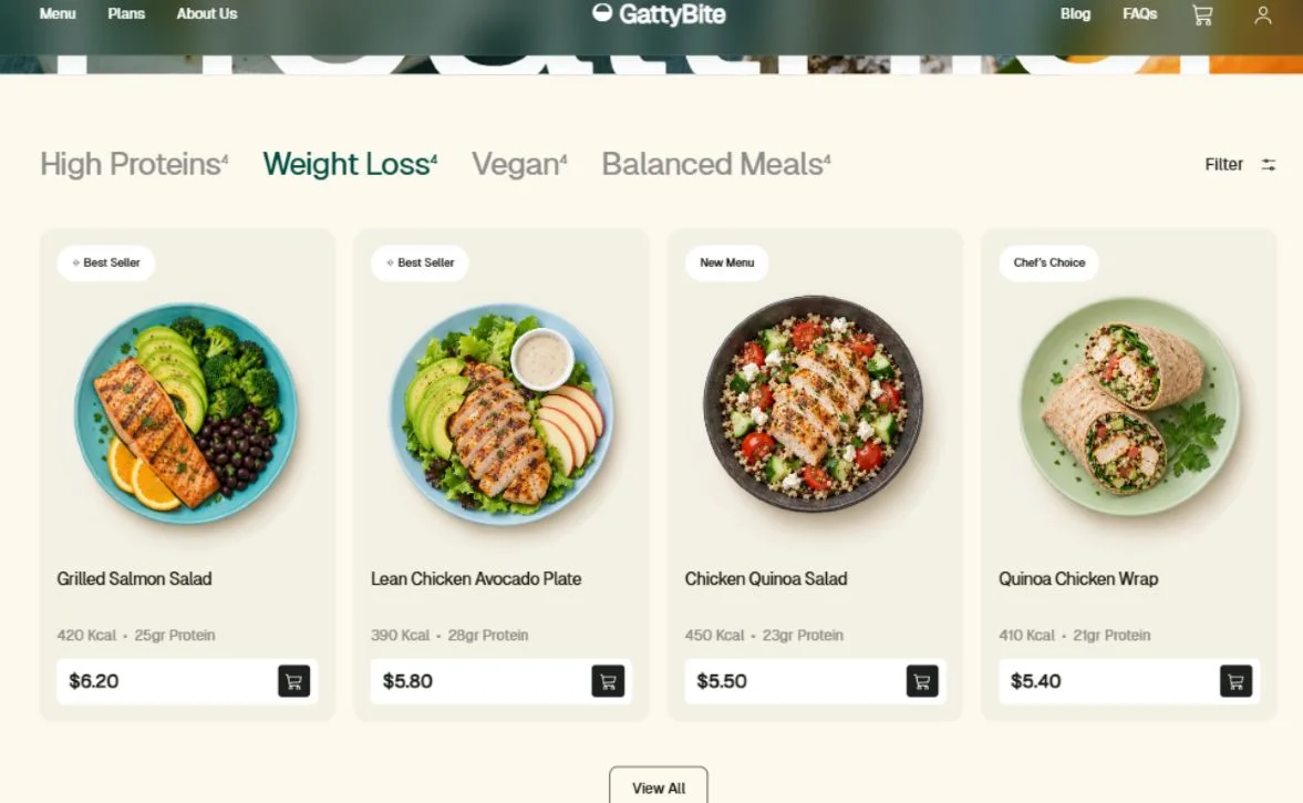
The useful detail is the alignment. A visitor can scan across the nutrition lines and prices without following a different vertical path through each card. Consistent image space also keeps one photograph from dominating the row. We think this works well for comparing a small set of meals.
The tradeoff is visible whitespace beneath shorter names. That space is intentional, but the layout still needs testing with longer client-supplied titles and translated copy. The sample calorie and protein values demonstrate the interface; they are not verified nutrition data.
Mobile: keep the type, change the card shape
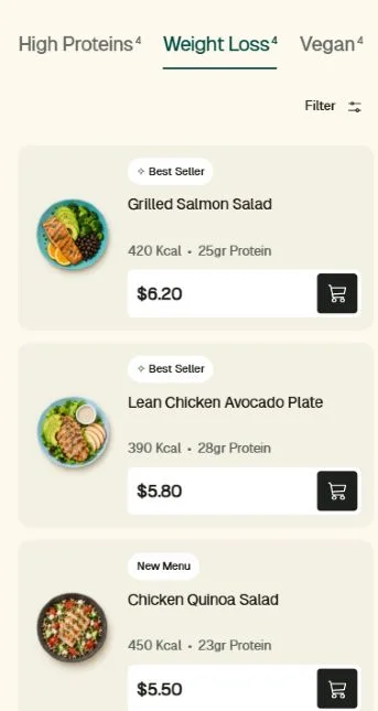
The superscript counts preserve the desktop design's character. An underline marks the selected category, so colour is not its only signal. Putting the photograph beside the details leaves more room for a readable title and a reachable cart button.
There is a cost: the category row cannot show every option at once. Visitors must notice that it scrolls sideways. The smaller food photos also show less detail. For a larger catalogue, we would reassess whether a visible category list or search would make meals easier to find; this four-category demo does not establish that.
Animation made layout bugs easier to see
The ordering section switches between four steps. Its descriptions have different lengths. Fading between them did not fix the jump because the container still changed height. We reserved space for the tallest description at the current width, using hidden copies in the same grid cell.
.step-content { display: grid; }
.step-content > * { grid-area: 1 / 1; }
.step-measure { visibility: hidden; }
/* Measurement copies must also be aria-hidden. */
This is the layout principle, rather than a fixed pixel height. It lets wrapped text determine the space. We used Motion for appearance and content transitions, while keeping content visible if animation code fails. Reduced-motion settings skip the movement.
Some fixes were simpler. The plan arrows needed spacing and four clearly different results. Each plan now has its own imagery, description, and destination. A meal image also had a shadow ending at a hard edge. Padding and an edge fade softened that boundary without changing the card layout.
Ordering steps: change the content without moving the section
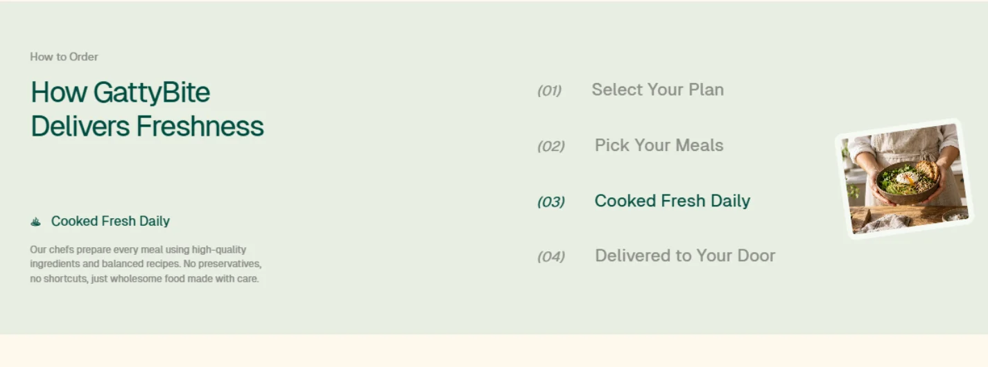
All four step names remain visible while the selected explanation changes. That gives the visitor a short overview and one detail to read at a time. Reserving the tallest description's space keeps the section boundary steady as the selection changes. The photograph provides a second cue that the content has changed.
The cost is more empty space for shorter explanations. A still screenshot also cannot demonstrate the transition, so try the step controls on the live site. We use a short fade to connect states, with reduced motion respected. This is a presentation choice, not evidence that animation improves conversion.
A homepage is not a complete browsing flow
We added Menu, Plans, About, Journal, FAQs, Contact, account information, privacy, terms, and journal articles. Shared navigation and footer markup keep those pages connected. A small Node build script generates the static pages from shared configuration and content. GattyBite itself uses HTML, CSS, and JavaScript; Astra is the model we worked with, not a frontend framework.
The sample cart survives page navigation within the session. FAQ search filters questions. Contact can prepare a draft instead of pretending that an email was sent. We kept checkout and account authentication out of the demo, and the legal pages explain its showcase status. A real operator would still need verified menus, policies, payment integration, and order handling.
Where Astra and the skills helped
We were happy with how Astra and our skills worked together on this build. The useful result was a repeatable cycle: point to a specific element, describe the problem, make a small change, and inspect it in the browser. Comments such as 'not too tinted' or 'the text jumps' became concrete edits instead of a fresh redesign.
The skills gave the model specific constraints. Image generation supplied food assets. Writing guidance kept the supporting copy direct. Cloudflare and Wrangler guidance helped with deployment. The minimal-code approach kept small interactions in the existing stack instead of adding a framework for each control.
That did not remove the need for review. We still caught weak mobile choices, uneven card content, excessive tint, and transitions that looked smooth until the text wrapped. Our satisfaction comes from the iteration and the finished browsing experience. We did not run a model benchmark or measure a productivity gain.
Check the page that actually shipped
We checked narrow layouts, category switching, cart persistence, navigation, FAQ search, and reduced motion in the browser. We also converted the food assets to WebP. Smaller files help the transfer budget, but that alone is not proof of faster rendering on every device.
Deployment had its own edge case: the first custom 404 setup returned the platform's default response. We corrected the static-asset configuration and checked the missing route again. For the release itself, we compared the commit in version.json with the expected merge commit. A successful HTTP response only proves that some version is serving.
You can try GattyBite, resize it, and switch between its meal plans. The original NutriBite concept is the reference to compare against. Our Showcase page keeps the demo and these build notes together.