Building GattyPower: a responsive energy dashboard showcase
How we turned an energy-platform reference into GattyPower, with mobile layouts, sample charts, Motion, and a verified Cloudflare deployment.
GattyPower's first narrow-screen check found a familiar problem: a row of tabs made the page wider than the phone. The fix was small. Finding it required opening the actual page, rather than judging the desktop screenshot.
GattyPower is our energy-platform showcase. It has a homepage, technology and solution pages, company information, a contact flow, and an interactive dashboard. Every energy reading is sample data. There is no connection to meters or equipment.
The reference gave us a visual direction
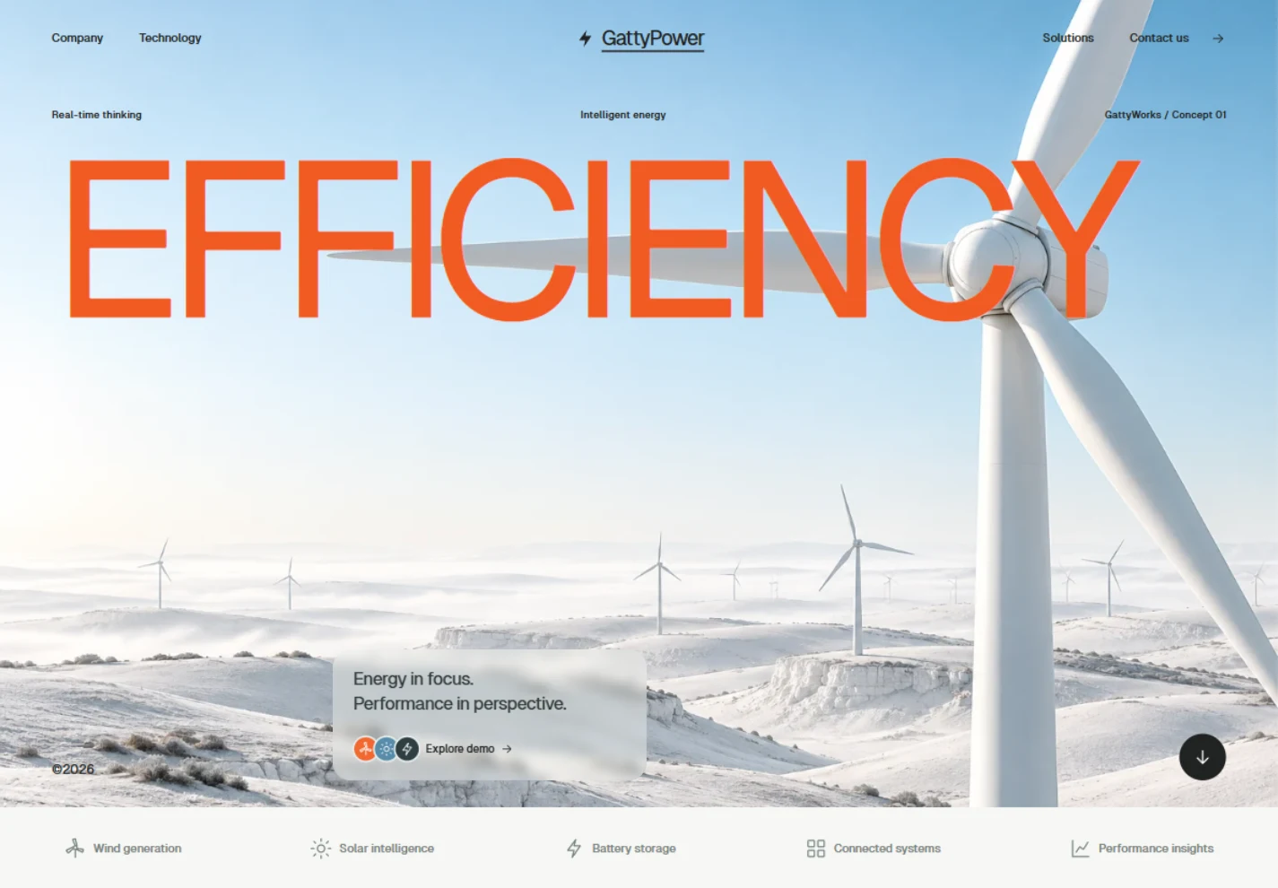
The starting point was Aetheris, Energy Intelligence Platform, posted by Arhansyah APP for Plainthing Studio. Its oversized orange headline, white turbines, pale blue landscape, and small circular icons defined the direction. GattyPower is a separate studio implementation, not a commission or collaboration with the original designers.
We generated a new turbine image for this build and converted it to a 109 KB WebP. The headline remains HTML text. The icons and favicon are SVG. That separation keeps the text readable and lets the layout change without baking the whole interface into a picture.
The benefit is a strong visual identity with a compact hero asset. The tradeoff is that the landscape is illustrative. A real energy company may need photographs of its own assets, with a crop that still leaves space for the headline.
The controls need to tell one consistent story
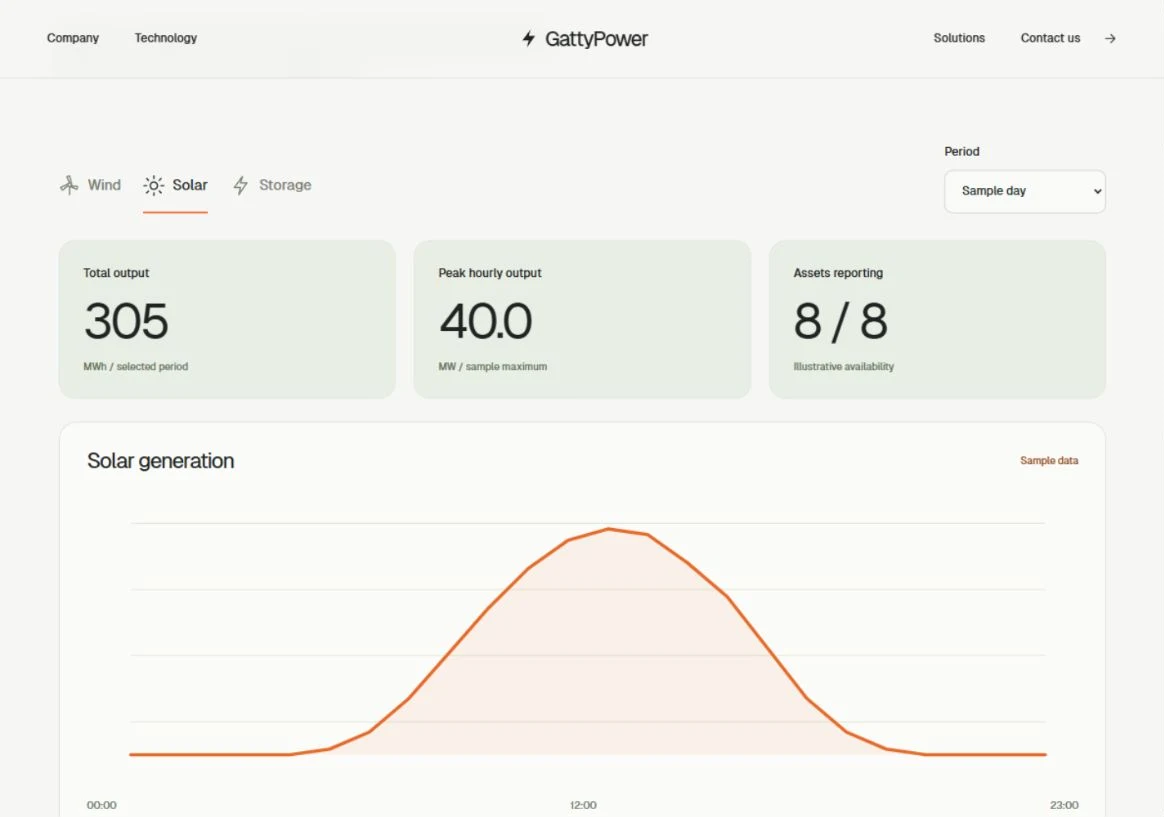
The dashboard switches between wind, solar, and storage. A second control switches between a sample day and week. One selected dataset drives the chart, summary values, table, and CSV export. This avoids the common demo problem where the chart changes but the numbers above it stay the same.
Units needed care. An hourly energy reading in MWh can describe average power over that hour. A daily total cannot describe an instantaneous peak. In the weekly view, we therefore label the metric Highest daily average and divide the largest daily total by 24. We do not call that value peak power.
The exact-value table is useful when the graph is too small or a reader needs a number. The limitation is that this is still a small fixed dataset. It does not test missing telemetry, time zones, delayed readings, or production-scale histories.
Mobile changed the arrangement
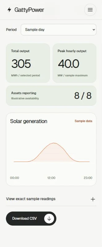
On a phone, the navigation becomes a dialog. The dashboard controls stack, the two output cards stay together, and the asset count takes a full row. The graph and CSV button sit below. We checked all eight content routes at a 320 CSS-pixel viewport.
The overflow came from a grid child's automatic minimum width. The capability tabs could scroll, but their parent still refused to shrink. Giving the grid children a zero minimum width let the intended scroll container do its job.
.about > * {
  min-width: 0;
}

.tabs.vertical {
  overflow-x: auto;
}
This preserves the text-led tabs instead of turning every option into a chip. The cost is discoverability: a horizontally scrolling row can hide choices. Keyboard arrows, Home, and End work, but a larger set of capabilities would deserve a different navigation pattern.
Motion stays separate from the content
We carried forward the lessons from GattyBite. Appearance animations use a small self-hosted Motion bundle. The page content starts visible, so a failed animation import does not leave blank sections. Reduced-motion settings skip the movement.
This was another build with Astra and our writing, image-generation, and Cloudflare skills. The useful part was the short feedback loop: build a concrete state, inspect it in the browser, then fix the observed problem. The model produced the layout quickly, but the mobile overflow still needed a browser check. We have not measured a speed advantage against another model.
A live showcase still needs clear limits
The contact form prepares an email draft for review. It does not pretend to submit a message. The privacy and terms pages identify the project as a showcase. This keeps the browsing flow useful without suggesting that a sample dashboard is an operational energy product.
The site ships as static pages through Cloudflare. After merging the release, we checked that power.gattyworks.com/version.json reported the exact merge commit. An HTTP 200 alone would only prove that some page was available. We also checked the dashboard, contact route, hero image, and a real 404 response.
The next useful test is your own: open GattyPower, change Solar from a day to a week, and compare the graph with its table. Before adapting it for a client, we would replace the sample data, agree the units and timestamps, and design the missing-data states.